
I don't know if I should be showing you yet another project, but I thought it would be interesting and exciting for those upcoming manga artists. I'm working on a 2d color raster-based manga today. If you're new to the terminology, have no fear, I shall define them right now. Raster is commonly known as bitmap. Jpeg, PNG, bmp, PNM, and the like are raster graphics. The GIMP, Adobe Photoshop, and PaintShop Pro are commonly used raster editors. Raster allows editing at the pixel level. Compared to vector graphics, which is at the shape level, raster is a lot more messy. But messy is good. There are a lot of things that a raster artist can do. I hope to explain them.
The first thing that a raster artist can do is create guidelines for the work s/he plans to do. The pencil is a perfect tool for guidelines. It doesn't do any anti-aliasing which is good for fill, quick erasure, and selection. Draw your sketch in 3 pixel wide pencil. If it looks as poor as the two characters seen here, then you're on the right track.
But don't draw the guidelines onto the background of the image. The best thing that a raster artist can do is separate each part of the image using layers. In Gimp, it's as easy as clicking one button. Next to my toolbox is always the Layers Box. I keep an eye on it, and I'm always switching back and forth from one layer to another. The Gimp slows down when you have too many layers. Saving is a serious pain at around 15 layers. You don't have to work on all the layers at once. You can split it up. That is what I have done in this image. I created Scene 1, Page 1, then I copied Box 1 into a new image and edited it there. When I'm finished, I can mix them together.
So I am working on a web comic. I'm hoping to make it a short thing. It may become regular if I find a niche for it. I started thinking about this manga when I was inspired to use my knowledge to make a real manga. It's interesting to think about 'real manga'. What is real manga? Well, there's a very specific art form that is defined as manga. Usually it comes in thick books from Japan. Characters have an 'anime style' look with big eyes and cel shading. But most manga is in shades of grey. There are around 12 pages of color in the average manga book. There's a practical reason why they don't use color for the entire manga -- price. Since color is much more expensive, manga is black and white. But if the cost was changed, it is possible to have color manga. How do I change the cost? By making it available by the web. That way, I can produce brilliant color manga for the same price as shades of grey.
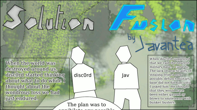
You can easily see that this manga is not finished. The two characters in the foreground are stand-ins. That's okay. Those are my guidelines that I will create my finished characters from. In fact, the guidelines are so vague, that the character's orientation is not defined very well. We know that they are probably walking. That's it. So the rest is up to me.
One thing that a raster artist can do is character sketches. Even if you're a bad artist like me, you can draw a character sketch. Start a new image with plenty of room. Start with the head, get the eyes, nose, mouth, and hair working. Then fix a body onto the character. It doesn't have to be perfect yet. The character sketch is what you base all other drawing from. You'll want the full front view. With that, you can do a lot of good work. In fact, I drew a character sketch with XFig, a vector graphic editor. Why didn't I use raster? Because vector graphics are good for perfecting angles and lengths. With raster, you can't adjust vertexes, you have to get the line drawn right the first time. That is one reason why vector graphics are so useful. Vector graphics can be converted into raster graphics, but not the reverse. So when I finish my character sketch in vector graphics, I can use it as a guideline in my raster.
Why don't I use vector graphics for everything? Vector graphics are frustrating. While they are good for some things, they have a certain niche. I couldn't create the forest background in Box 1 very easily in vector graphics. I would have to draw each pine needle individually. It would be impossible to create such things in vector graphics. If I wanted to leave that type of thing out, I could do a manga in vector graphics. But I probably would want to leave it in shades of grey because flat colors aren't very pretty. What is the lesson? Every medium has pros and cons. Two different mediums won't always be polarized, so you have to decide which covers all the things you want the best. I cannot suggest 2d vector graphics for manga. Someone else might suggest vector graphics for manga, so this is just an opinion. I can suggest 2d raster graphics for manga. I can also suggest 3d realtime-rendered graphics for manga, but that's another story.
One thing that I had a bit of trouble with was size. There are many problems with creating something at the same resolution that it will be viewed at. For one, anti-aliasing has to be perfect. That's something that I'm pretty bad at. So I decided to work at 300 dpi and publish in 100 dpi. One advantage at working in 300 dpi is printing. Most printers gladly accept 300 dpi. So if I ever print this, it'll be quite nice. But 300 dpi is a ratio term, not a measurement term. I decided to use a ruler and measure my favorite manga, Gunnm Last Order to get the proper size. I found that it was approximately 7.0x10.1 inches. This makes a very even conversion to 100 dpi and 300 dpi: 700x1010 px and 2100x3030 px. The full size at 300 dpi is pretty massive even on my 1600x1200 monitor. Scrolling around and zooming the image is pretty easy, so don't worry about size that much. As long as you have a scroll wheel on your mouse, you're in good shape.
The things that I am leaving out are: how to make a forest background, how to shape your boxes for best usage, how to stage the boxes for best flow, and many such things that go on in the making of a manga. These things are for you to find out; I wouldn't tell you if I knew myself.
I think the most important part of creating something is the motivation. There needs to be something to drive a person to use their time and talents to create something. Usually it is fun or there's a profit in mind. But both of these ideas ebb and flow with time. How does a person continue when something is so difficult that both fun and profit are out of the question? Some higher motivation must pull a person towards the goal.
Erwin Schroedinger, inventor of the famous Quantum Mechanics equation with his name, wrote a scientific book about the source and process of life. It was so amazing that it has inspired many scientists and artists to rethink their philosophy of life. While Schroedinger didn't specifically state his findings as a philosophy, it easily became a full philosophy of life, competing with and complementing many contemporary and classical philosophies. Schroedinger called it Negative Entropy. Transhumanists call it Extropy. Entropy is described in the Second Law of Thermodynamics. It is a well-defined and quantifiable variable. Schroedinger defined life by its action towards negative entropy. While people will make fun of humans gravitating toward entropy, it is a basic fact that life tends toward negative entropy by its active choice. You can see that this is serious science.
This is what motivates me: negative entropy. Every moment of my life is either toward entropy or away from it. The more work I put into positive goals, the less entropy that I contribute to the world. I am alive, I prove it by my work.
Permalink
-
Leave a Reply


Comments: 0
Leave a reply »